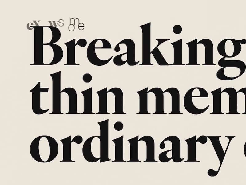
The other day, I was browsing a nicely designed “About” page, and, like many other sites, it had the familiar pattern of a fixed logo at the top while scrolling. This is quite common, but sometimes the logo ends up overlapping with the text, making things a bit hard to read. You might see this as a quirk of brutalist design, but it got me thinking: what if we hide the logo during those moments when it intersects with the text?
And what if we hide it with an animation? That opens up a whole range of creative possibilities to explore. So, I decided to test it out and see how it would look. Here’s a little experiment that might spark some ideas if you’re into animation patterns like this. It’s just a proof-of-concept, nothing fancy here, so don’t get excited 🙂
I call it a “context-aware animation” because the logo animates based on its interaction with the visual context.
Hope you enjoy these playful ideas and thanks for checking by 🙂

