

Naked City Films is a New York–based production studio known for its deliberate, confident, and visually distinctive work in commercial and narrative filmmaking. Their projects are characterized by rhythm, control, and intentionality—an attitude that fundamentally shaped the expectations for their website.

The Challenge
Redesigning the company’s website wasn’t about aesthetic variety or technical novelty: the challenge was restraint paired with intensity.
A conventional portfolio structure would have flattened the studio’s personality, while excessive visual effects would have distracted from the work itself. The site had to express confidence without explanation, movement without chaos, and structure without predictability. Every choice needed to support the feeling that Naked City Films knows exactly who they are and trusts their audience to follow.
The result needed to feel active at all times, even in moments of stillness.
Design Direction and Visual Language
Brutalist Influence as a Foundation
The design language draws from brutalist architecture, where structure is visible and hierarchy is never hidden. Blocks feel heavy, spacing feels deliberate, and scale is used as a primary tool for emphasis. Nothing is decorative for the sake of decoration. Each element occupies space with purpose and clarity.
This approach created a visual system that feels confident and direct, mirroring the way the studio approaches filmmaking.
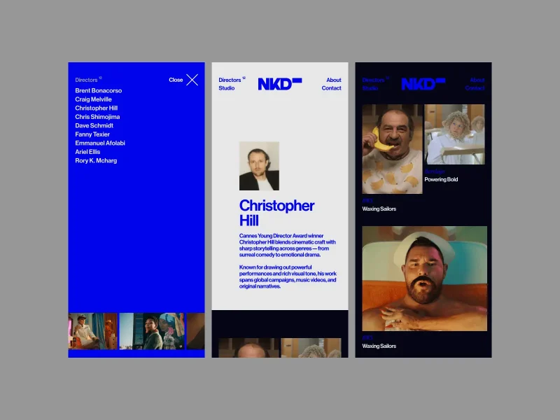
A Monochromatic Electric Blue System
The decision to work with a single electric blue tone was driven by a desire for clarity and focus. Rather than relying on color variation to create interest, the interface allows motion, typography, and imagery to do the work.
The monochromatic approach removes noise and builds recognition quickly. It also reinforces the idea that the site is a controlled environment, where every deviation is intentional.
Cultural References and Easter Eggs
Subtle references to internet culture and filmmaking language are embedded throughout the experience.
These moments appear in small behaviors, unexpected interactions, and details that reward attention without demanding it. This includes the subtle screensaver that pays homage to the classic bouncing DVD logo, and the image-trail effect on the logo in the site’s footer.
They are not explained or highlighted. Discovery happens naturally through exploration, reinforcing a sense of curiosity and play without undermining the overall restraint.
Confidence Expressed Through Reduction
Brand confidence shows up through what is removed as much as through what remains. Copy is minimal and avoids explanation. Visuals are given space to speak for themselves. Transitions are bold without being theatrical.
The site reflects the same belief the studio places in their work and in the clients who choose them.
Motion as a Core Design Material
Movement is treated as a foundational material rather than an accent. Elements rarely sit idle, yet motion never feels gratuitous. Transitions feel closer to editorial cuts than traditional fades. Hover states respond quickly and decisively, reinforcing a sense of immediacy.
The goal was to create an interface that feels alive without ever feeling restless.
Technical Architecture and Creative Development
The following sections explore how the site’s design intent is translated into technical structure, with Tomas Kmet expanding on how code, logic, and experimentation work together to support rhythm, control, and motion.
The underlying technical stack used on the project:
- Full stack VueJS framework Nuxt
- Canvas3 – self-developed Nuxt module for ThreeJS integration and additional features as smooth scroll and scroll based animations
- ThreeJS for image hovers and reveal animations with GLSL shader functions
- GSAP animation library for timeline animations with complex steps and good performance
- Sanity.io content operating system, with orderable document list plugin for easy content management and ordering by drag and drop
Custom Code and Full System Control
Every interaction across the site is custom-built, avoiding generic animation libraries or default interaction patterns. This approach allows precise control over timing, sequencing, and behavior, keeping motion aligned with the overall rhythm of the site.
The system is designed to feel intentional rather than automated.
Beneath the surface, Canvas3, Nuxt module handles Three.js integration alongside core features such as smooth scrolling, image rendering within the Three.js scene, and scroll-speed manipulation via directives.
The layout component is the main entry point for using the Canvas3 module. The layout wraps the main content of the pages to a smooth scroll element. This gives us control over the scroll and also usage of “on-scroll-action” directive. Within the directive, we have developed several features for full control, such as callback function for element reveal, scroll feedback function passing scroll position for scroll interactions, fixed scroll option and more, with some detailed additional options for active state of the element with the directive, which gives the directive wide range of usage within reveals, transitions and reactivity to scroll. The directive enables element tracking, per-element scroll-speed control, and the definition of viewport-based callback functions.
The layout component also initializes a ThreeJS canvas. With the “canvas3-image” directive, we can easily add images to the ThreeJS scene, defining which shader to use and setting up uniform values directly on the image element. The uniform values are then passed to the shader. This way we are able to define the animation triggers on the component level.
All animation logic ultimately flows down into a single requestAnimationFrame loop within the Canvas3 module, responsible for smooth scrolling, Three.js scene render, element-entry animations, and page transitions, for smooth performance.
Layout Logic Without Fixed Templates
Layouts respond to content instead of following rigid templates. Each project is given its own spatial logic, which prevents visual repetition and keeps navigation unpredictable without feeling disorienting.
This flexibility supports growth while maintaining character.
The CMS solution, built with Sanity.io, was designed around content flexibility. Image height defines the height of each row, creating space for fixed-scroll effects on shorter content thumbnails.
At the same time, the system gives content editors full control to adjust content, modify overall layout structure, and manage the order of projects, both on the homepage and independently for each director.
Page Transitions as Narrative Devices
Transitions function as connective tissue rather than decoration. Entry and exit states are designed with the same care as visible layouts, creating continuity between sections and reinforcing pacing.
Navigation feels more like moving between scenes than loading new pages.
The technical challenge was to design a robust system that could support all navigation states across the site navigation structure, page overlay, header logo, and the directors overlay menu. This included the initial load, scroll-driven welcome transition, interactions within the directors navigation, and full page transitions.
All interactions and transitions were implemented using functionality provided by the underlying Canvas3 module, enabling seamless binding between scroll input, welcome transitions, and smooth page overlay animations.
Hover States and Interaction Feedback
Hover interactions are fast, purposeful, and restrained. They provide immediate feedback while reinforcing hierarchy and direction, avoiding unnecessary flourish.
Each interaction exists to guide attention and maintain momentum.
All interactions are built as reusable components, structured in code to reflect the underlying design system. Hover states follow a consistent logic across the site, reinforcing hierarchy and clearly supporting the action triggered on click.
Video Handling and Performance Decisions
Video plays a central role across the site, which required careful handling to maintain responsiveness. Loading strategies, scroll-based triggers, and motion thresholds are tuned to prioritize perceived speed and fluidity.
The experience remains immersive without overwhelming devices.
For the film thumbnail hover state, a custom shader was developed with reference to a CRT screen. The effect dissolves the image into RGB-like channels, using a color palette adapted from pure red, blue, and green into tones more closely aligned with the Naked City Films brand.
Video autoplay is triggered on hover, with sufficient buffer time to allow the media to load while the shader transition completes.
The same CRT-inspired shader is reused in other areas of the site where image-reveal animations are applied, ensuring visual consistency across interactions.
Mobile-First Thinking
Mobile behavior was refined with reduced motion and a stronger focus on touch interaction. Views are simplified to minimize distraction on smaller screens while preserving the site’s core character.
The site is built on a scalable grid system that adapts content fluidly across screen sizes. Responsive adjustments strike a balance between maintaining consistent animation and transition language across devices, while never compromising accessibility or usability on mobile.
The experience retains its character across screen sizes.
What This Project Explores
This project explores how design intent and technical execution can evolve together. Visual decisions inform code, and technical constraints shape design outcomes. The result is a site that feels cohesive, expressive, and grounded in craft.
Closing Reflection
The Naked City Films website does not attempt to describe filmmaking or explain its process. It behaves like it. Through structure, pacing, and confidence, the site communicates its identity in the same way the studio communicates through film.
Every detail, from layout to animation timing, contributes to a system that feels alive, deliberate, and deeply aligned with the studio behind it.